
IMAGINE graphics and logo -the idea behind it
Why the gradient, why the open lines in the logo, and why the bright colours? We talked to Art Director Tormod Aasland at Fasett to learn more about the creative process behind the IMAGINE profile.

How do you develop a theme and a profile for an event 18 months in the future – without risking it being outdated? The progress behind developing IMAGINE as a theme and the profile that follows started right after ONS 2022. The theme will work as a guiding principle for the programme development and communication towards ONS 2024.

IMAGINE is built on four pillars: Climate, Security, Leadership and Technology. It is a theme where we not only imagine the possibilities but truly call to action.
Read more about the foundation behind the ONS 2024 theme IMAGINE here.
So, how do we choose graphics and a logo to support this?
“The colour scheme and background shading used in the ONS 2024 branding were carefully selected to symbolize the event’s key themes of energy, horizon, the future, transitions, imagination, and focus, explains Tormod Aasland,” Art Director in the communication agency Fasett.
He adds:
“The design team chose the classic ONS brand colours but gave them a contemporary twist, using coloured radial gradients with sharp borders to create a dynamic and visually striking effect. The use of gradients symbolizes the transition and change that is at the heart of the energy industry. While the sharp borders represent the focus and precision that is needed to navigate this complex field. Want to see more of Fasett’s work?
The connection between the ONS logo and the new Imagine logo:

To stand out
To ONS it is important to be relevant for the stakeholders, but still dare to be a little different. The colours, the gradient and the focus on creating a relevant and visionary theme is therefore a top priority.

“We want to stand out, to be little different, but still be recognized and taken seriously. What we really like about the profile, the graphics, and the theme film is that it challenges and makes us question and wonder,” says ONS Communication Director Inger Johanne Stenberg.
She adds:
“I really like how the theme film comes with a punch and a sense of urgency. It makes you eager to go out and make a difference.”
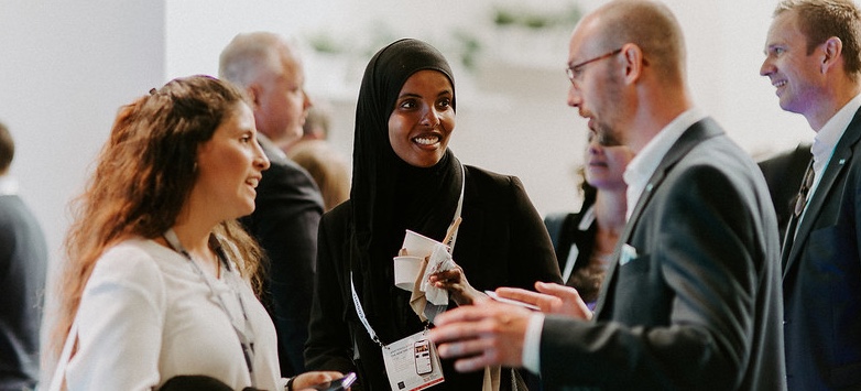
That sense of urgency is something ONS wants to bring into the meeting place and exhibition in an even bigger way than before. A good place to grow, learn and get things done.
“We call it the leading energy meeting place. We do not aim to be the best solar power conference or the best offshore wind exhibition. We want to be the complete story and the best place to know and learn from the synergies between different technologies and industries. An energy campus in a way, “Stenberg says.
Overall, the design is intended to convey a sense of transformation, progress, and forward momentum that hopefully inspires visitors and captures the excitement of this dynamic and rapidly evolving industry.


Volunteer at ONS?
Equinor to partner up with ONS+
.png)